Cover Art
The cover of the newspaper is what makes many students and University community members decide to pick up a copy. I took great pride in creating the leading image for the paper. I strived to create new and interesting covers which accurately reflected the hard work inside the paper.
Below are some of my favorite covers I created in my two terms as Photography Editor with the Cavalier Daily.
Celebrate New Art
This cover highlighted a story from the Arts & Entertainment section of the paper on a series of student plays put on in the performing arts department. I used a font which was creative and youthful, like the work I photographed. I took this photo with this cover in mind, knowing that I would need space for a title, subtitle, and page number in a balanced way.
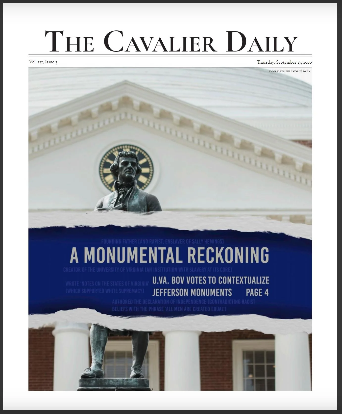
A Monumental Reckoning
This cover story was about the removal of confederate monuments in Virginia and the decision to not remove statues of Thomas Jefferson at the University. The text on in light blue highlights his complicated legacy; that the good he did does not erase the bad. I created the ripped paper effect because we wanted the theme of pulling back the curtain and examining the truth behind these statues and their histories. The ripped-edge paper and artificial shadow along it convey the idea that the text is a truth revealed.
This cover won first place in the Virginia Press Association 2020 awards for the non-daily, circulation size group 3.
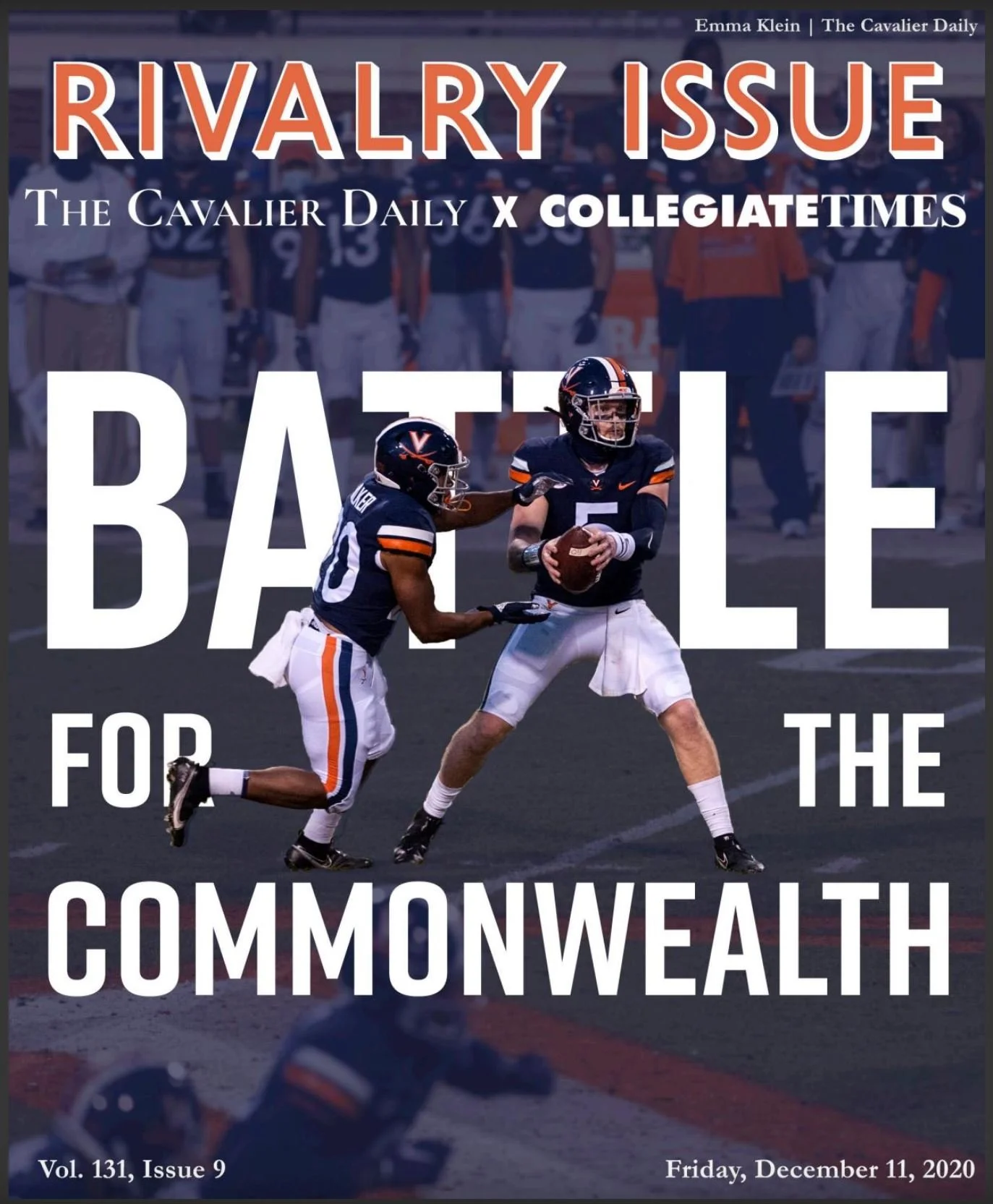
Battle for the Commonwealth
This special release issue was made for the University of Virginia vs. Virginia Tech yearly football game. For this special issue I used the same font we always used for the date and issue number, however removing the standard white border and header placement marks this issue as significant. The background of the photo which is not cutout over the text is hued blue to make the text clearer. The text is still legible beneath the player cutouts due to placement, font, and word choices.
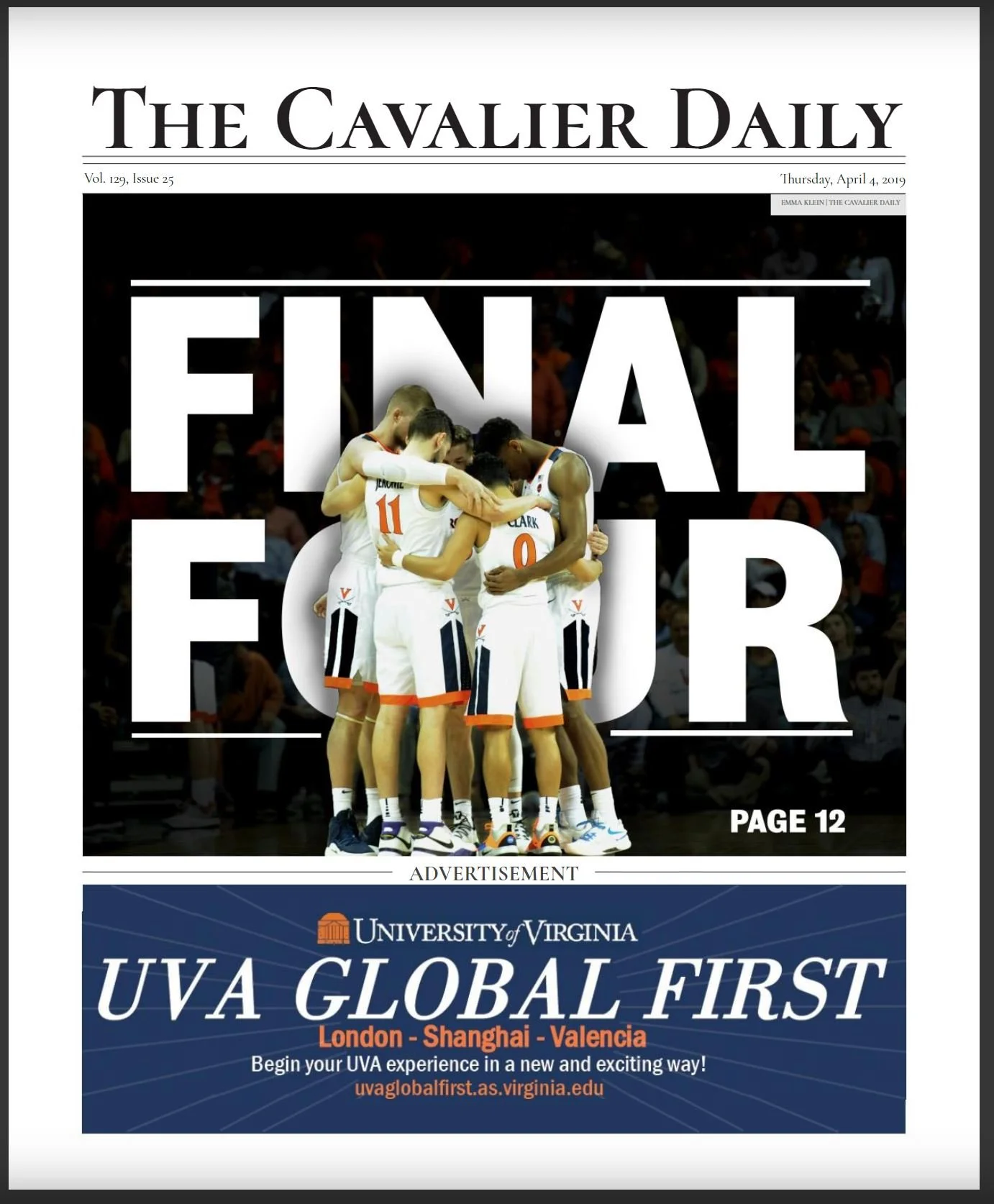
Final Four
I decided to use a photo of the team that shows them as a group and shows a moment of dedication to each other rather than an action shot that highlights only a single player. I think this cover shows the monument of the team accomplishment to get this far in competition. At this moment the student body was holding their breath waiting to see if the team would advance so a moment before movement best matched that idea.
Champions
This cover came after the men’s basketball team won the NCAA championship. This was a moment of celebration for the entre university that culminated in parties until the early hours of the morning and professors canceling classes the next day. I wanted this cover to be full of energy and showcase the important players that led to the win. The photos of the players and coach were taken by a staffer who was able to travel to Minnesota for the game, the concept and edit was done by me.
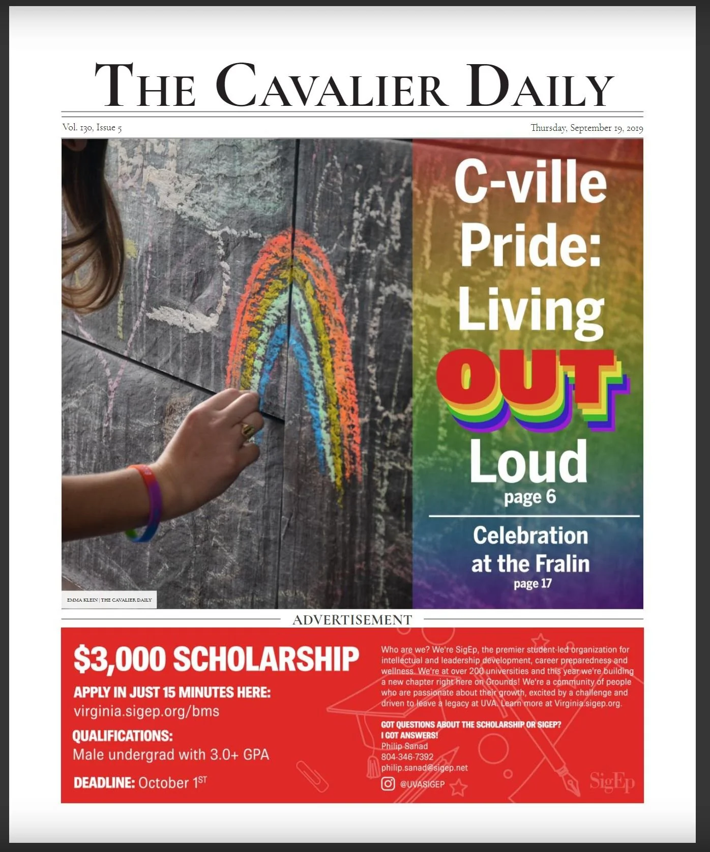
C-ville Pride
I wanted to use a picture I took at the Pride event that didn’t feature someone in an identifiable way to ensure that the paper respected anonymity and did not out any attendees of the event. I created a text and gradient overlay which are interesting and relevant to the story but are still easily legible.
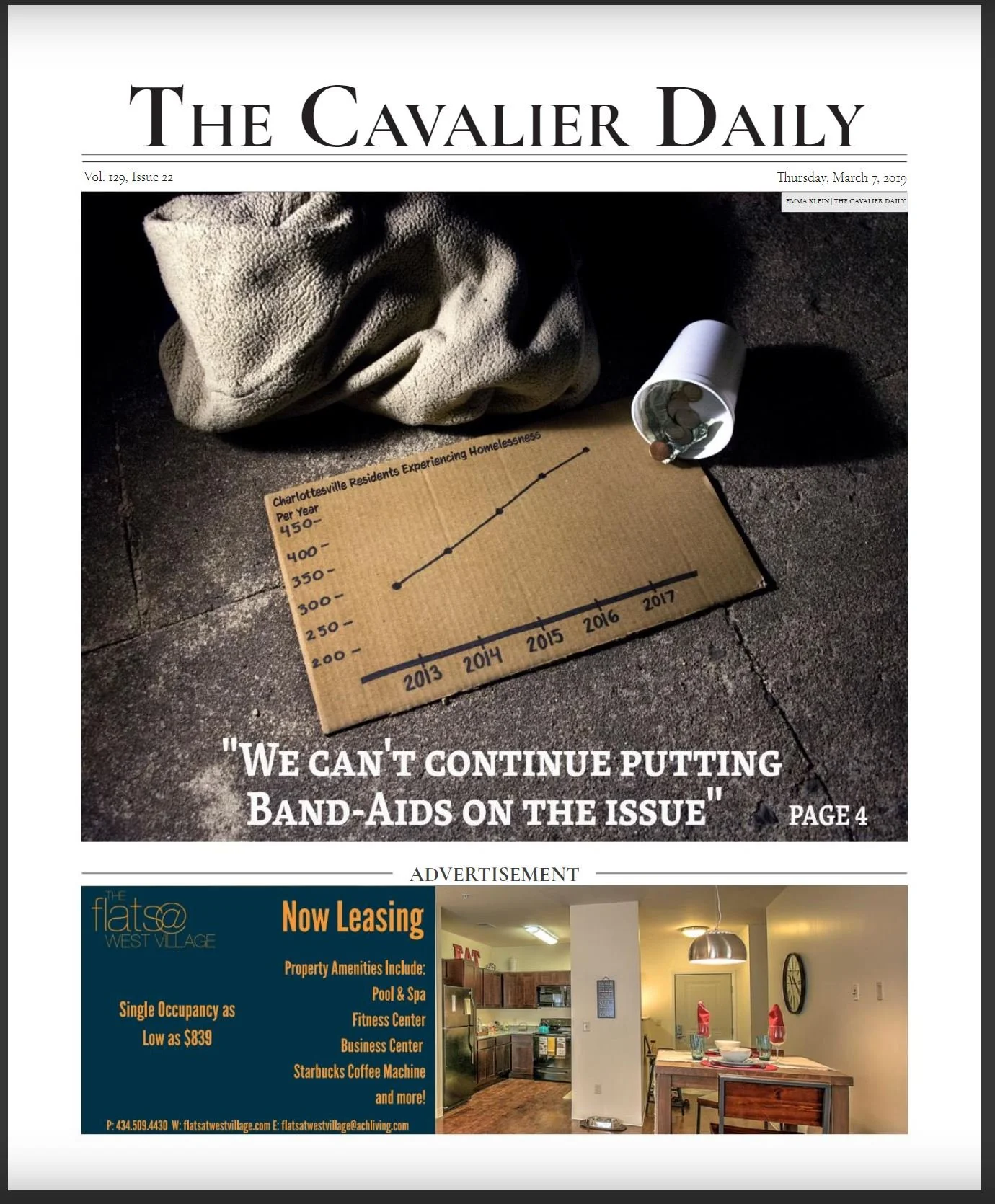
Addressing Homelessness
This is a photo I staged with props. I did not find it appropriate to photograph someone who was actually experiencing homelessness to be the subject with their suffering on display. I wanted to create an image that had stark contrasts and icons of the issue without being cartoonish or exploiting someone who is actively suffering.
I created the graph with data collected by the writer of the story.
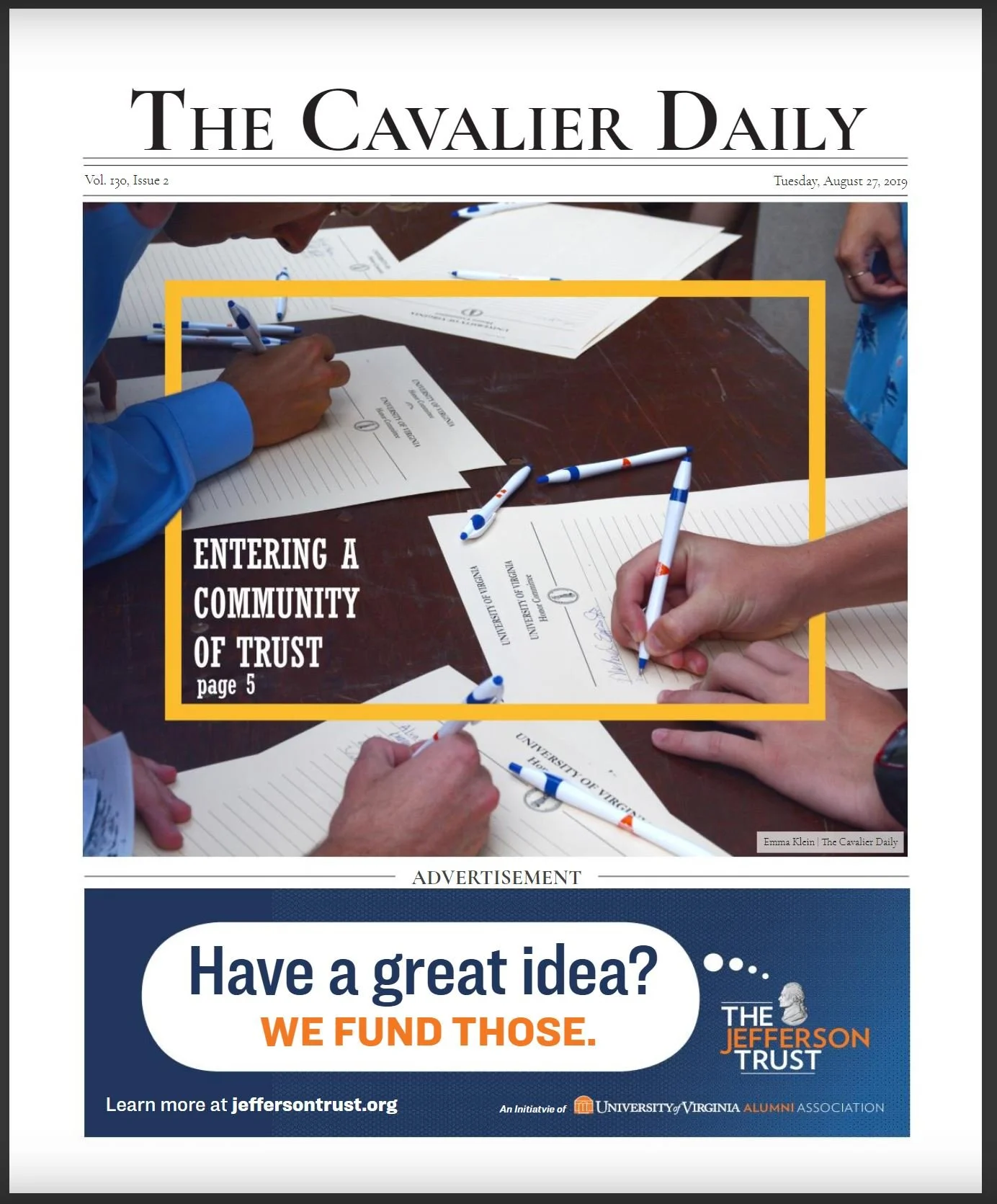
Entering a Community of Trust
This photograph shows an event that all students of the University of Virginia attend at the start of their first semester, commencement. At the end of which, students sign the honor pledge to join the school community. I found this picture more interesting and dynamic than photos of students sitting in chairs watching the Dean of Students address them. The orange box helps focus the picture and gives the title and page number a more purposeful and designated place to reside.
Community & Confidence
This cover showcased an article from the Arts & Entertainment section of the paper about a student fashion show. By using three vertical photos I was able to best showcase the work these students created by not cropping out any part of it. For the title and page number I paid homage to a favorite tv show of mine, Project Runway by creating the title in a similar format to their logo.
COVID-19 Safety Protest
This cover is of a student-organized protest about the University’s COVID safety protocols. The cutout is from a photo I took of students moving back into dorms. I feel that the subtitles on this cover are well balanced and the overall structure is engaging. I played with black and white vs color to represent the students being perceived as individuals, not just a general student body.
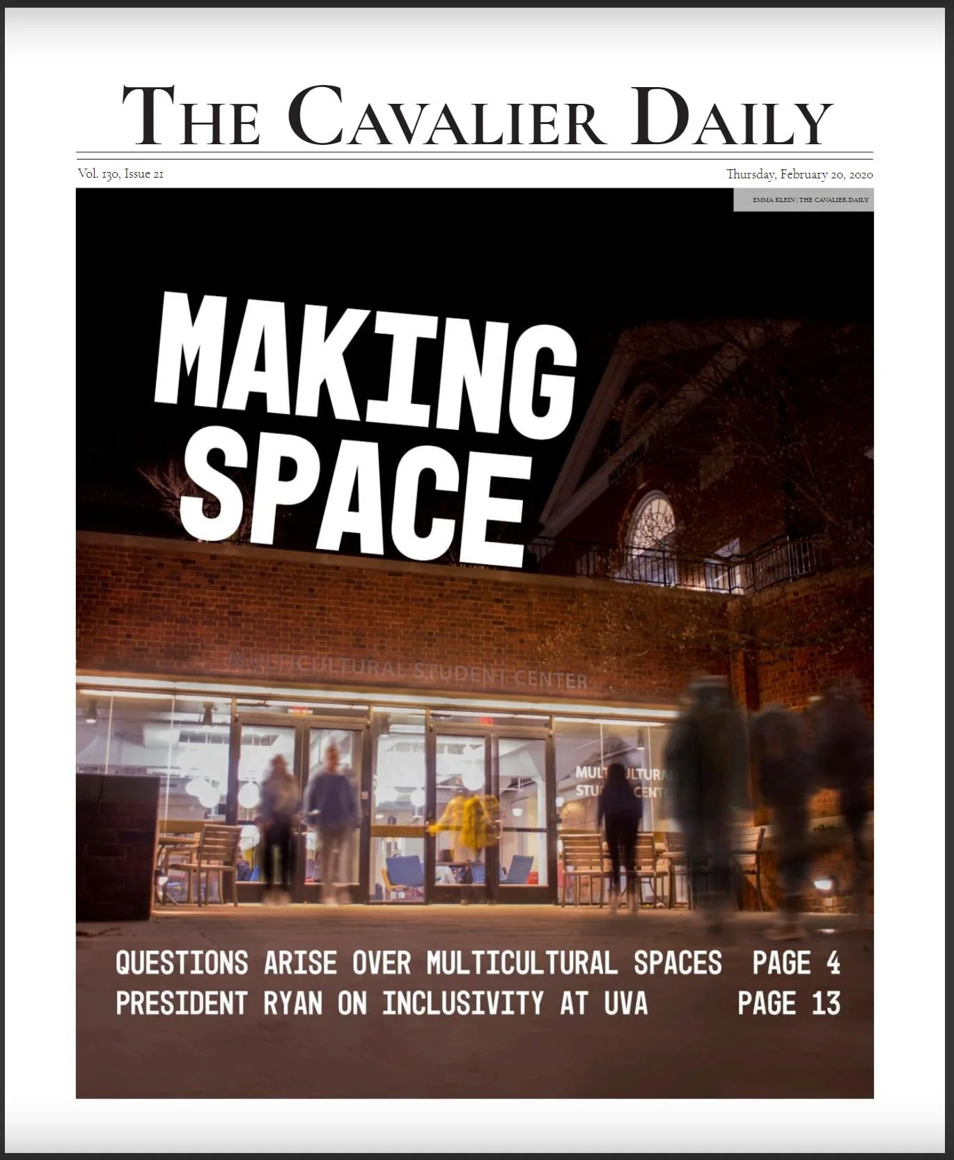
Making Space
I enhanced this long-exposure photo by increasing the blur on the moving people. I wanted to show that this place is frequented by many students. This cover shows the new Multicultural Student Center and references two articles within that touch on this topic. These new student spaces were a subject of heavy debate and scrutiny among students so did not want to feature a specific or recognizable person in regards to this story who might become the face of such debates.
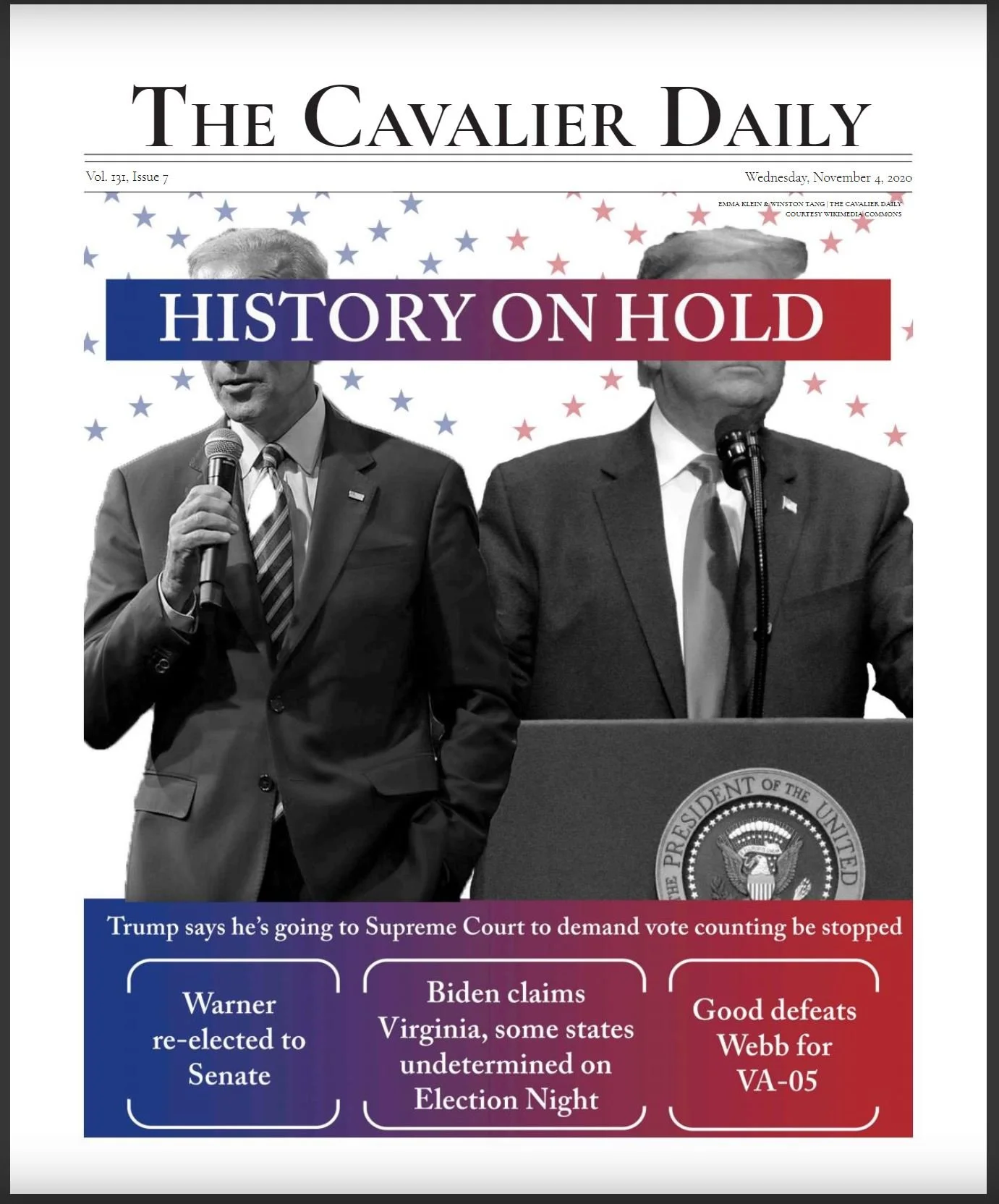
History on Hold
Although I did not take these photos I did design and create this cover for our election issue which went to print early November 4th, 2020, days before the election was called. I wanted to include the information that we did have confidence to report while being clear about what was still undeclared. I used the blue to red gradient to represent the two parties as in an undecided way. I thought that covering the faces of the two candidates would be a visual way to depict the lack of a clear winner at the time of publication.
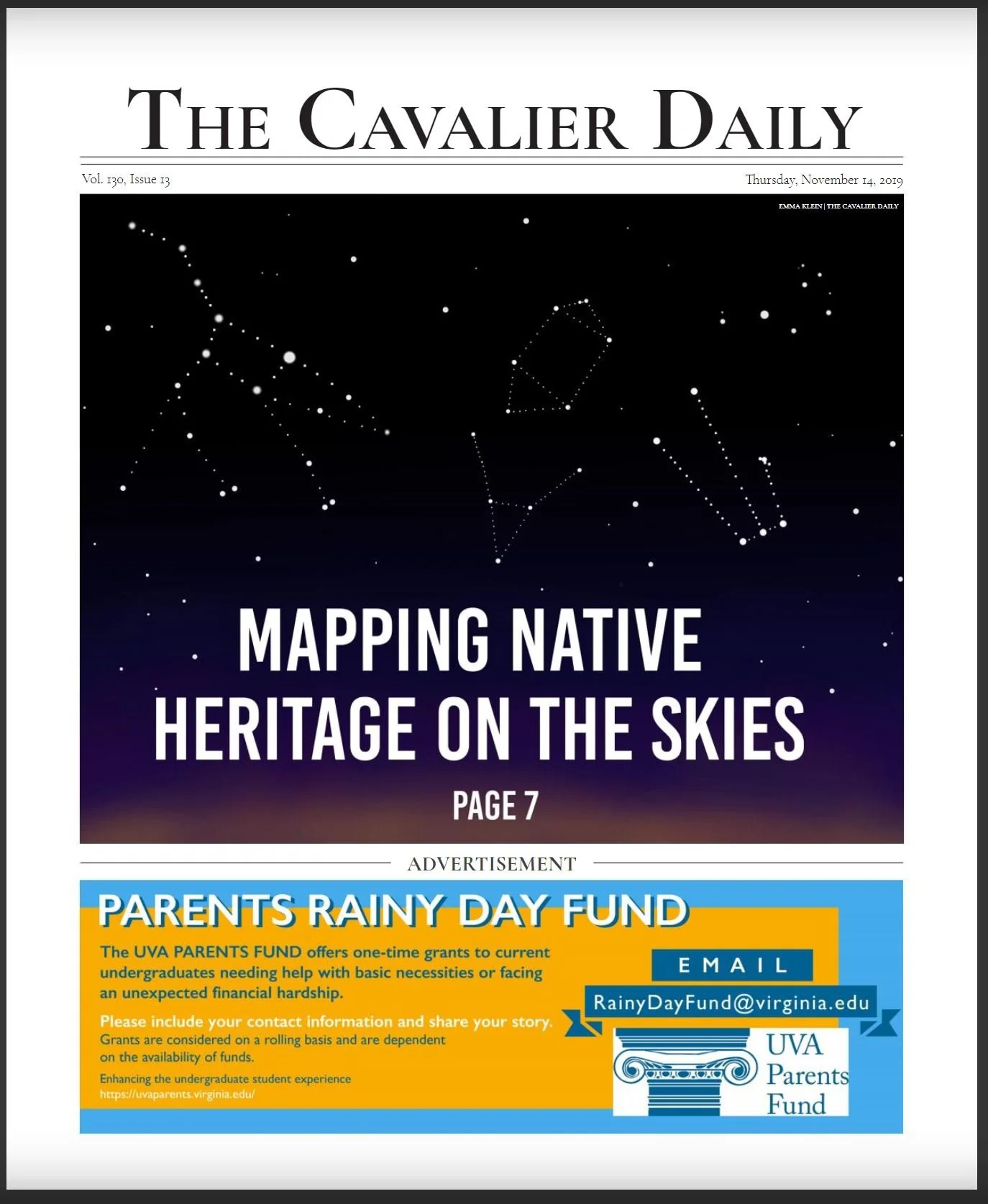
Mapping Native Heritage on the Skies
I created this graphic to represent a story about an event on Native American astronomy practices and culture. I researched real Native constellation star maps and recreated them in photoshop. It was important to me to honor the ideas in the article and the event itself by creating an accurate representation of the ideas discussed. The sunset gradient adds color and depth to the graphic to keep it from appearing flat and extremely cartoonish.
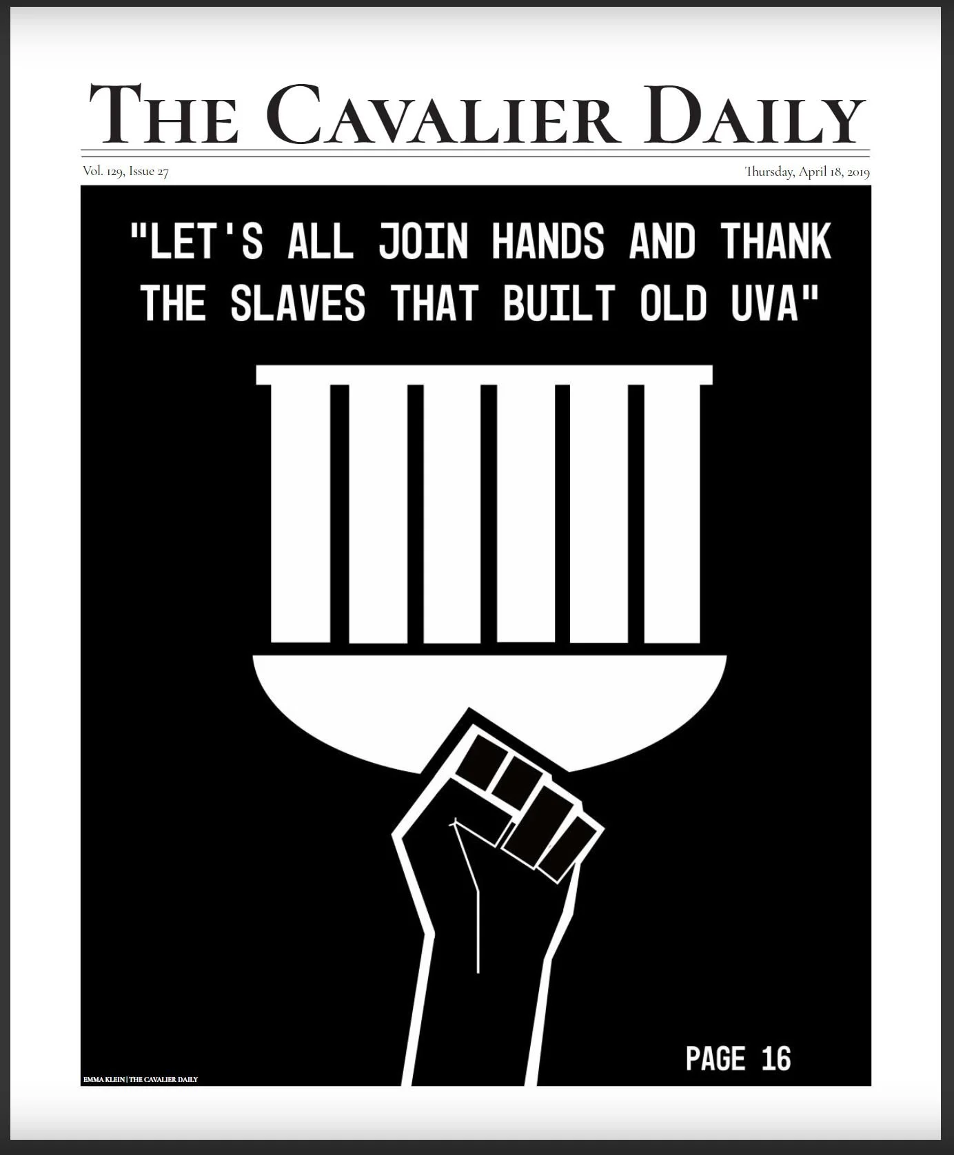
UVA’s Slavery History
The article this cover was promoting was a very serious article about the history of slavery at the University of Virginia and what we can do today to acknowledge that legacy. I wanted to create a graphic that was crisp and simple to convey the serious tone of this piece. I thought that a photo would be putting someone at the front of this discussion that was being had by many. This graphic features the Rotunda, the most recognizable and famous building at the University, turned upside down in opposition to a black fist that is rising up against it. I felt that the start simplicity of this cover was appropriate and would draw reader in because it differs from out usual colorful covers.
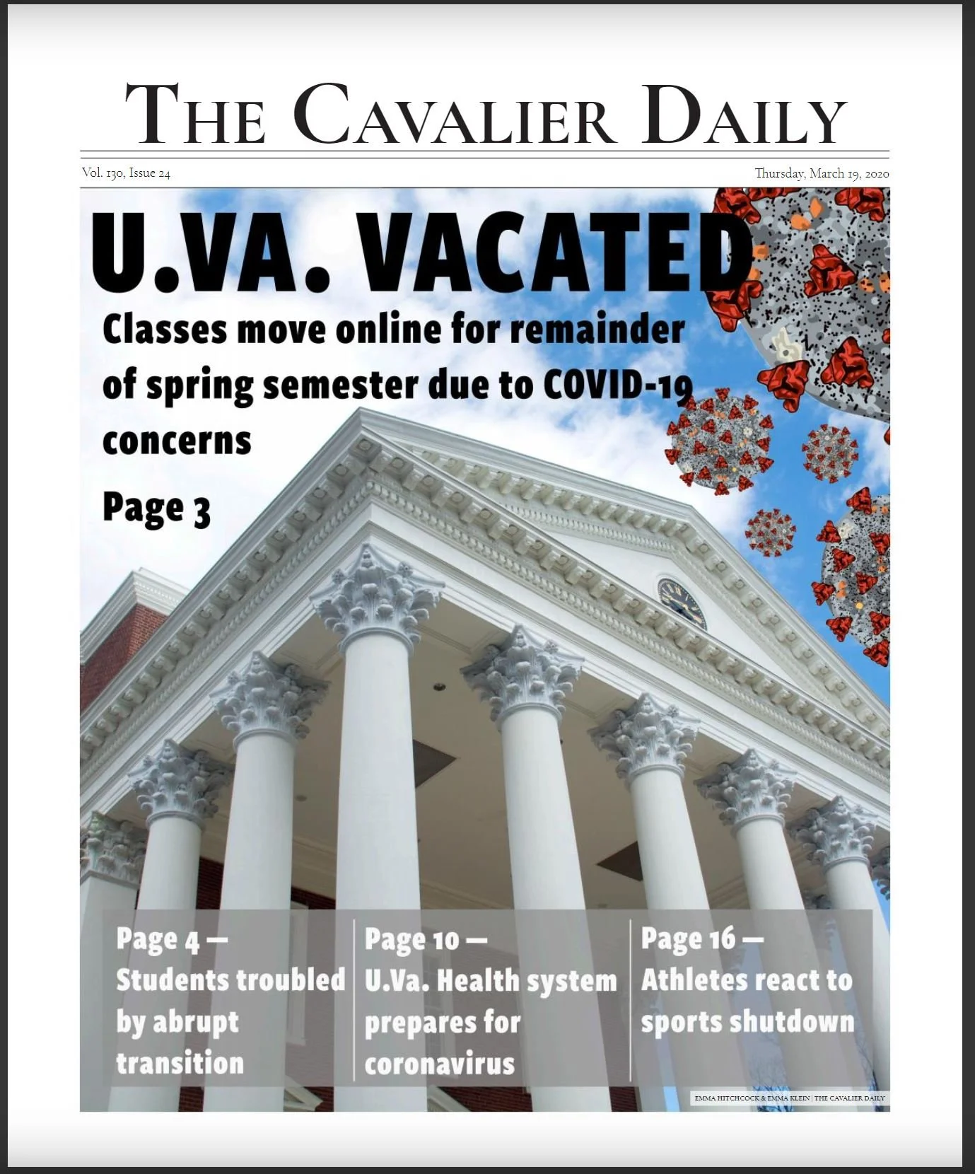
UVA Vacated
This cover includes page references to many related stories, this is why the photo is more generic. The upward angle of the most recognizable building at the University represents that the University is powerful and looms over the students in terms of important decisions regarding COVID-19 safety.
This cover won first place in the Virginia Press Association 2020 awards for the non-daily, circulation size group 3.
The COVID-19 graphic was not made by me, it was created by the graphics editor at the paper.
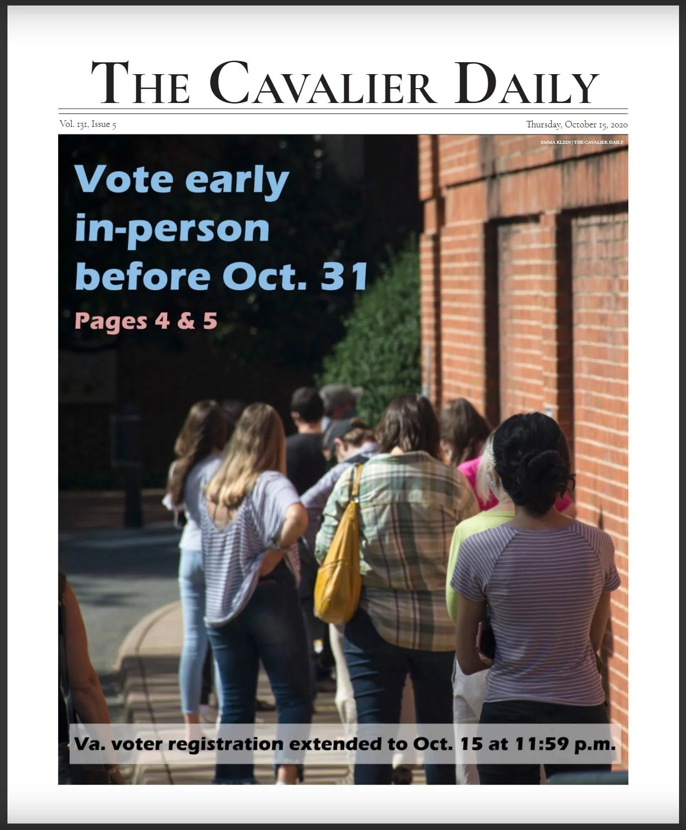
Early Voting
As a news source, we strived to keep the act of voting neutral outside of opinion pieces. I took this photo to show the idea of voting, not of any specific person voting. I also thought it was important to keep this photo anonymous because this vote was very divisive. I wanted to show that voting was the norm and took a photo when the line stretched outside the building for early voting near the University. I also took this photo knowing it would leave ample space for a title and page number in the upper left that would be clear against the dark.
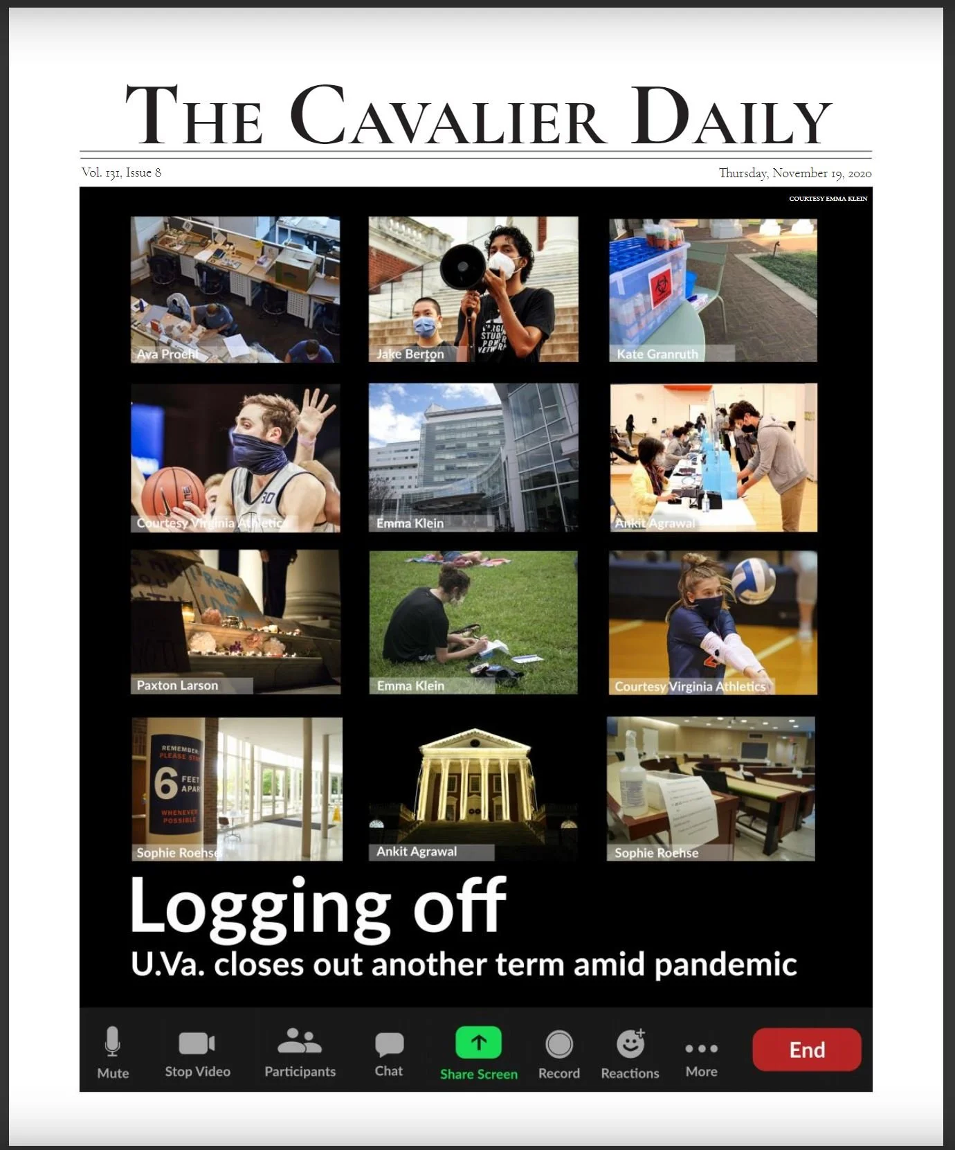
Logging Off
I designed this cover for the end-of-semester issue in which we highlight the major events that have happened in the past semester. I decided to do a play on the zoom screens that all of our classes were meeting over. The photographer credit is included as the Zoom name at the bottom of the photo. I curated these photographs from the semester and arrange them in a way I found complimentary.
The Zoom icons are not screenshotted from Zoom, I created them all in photoshop to be similar to the actual icons.
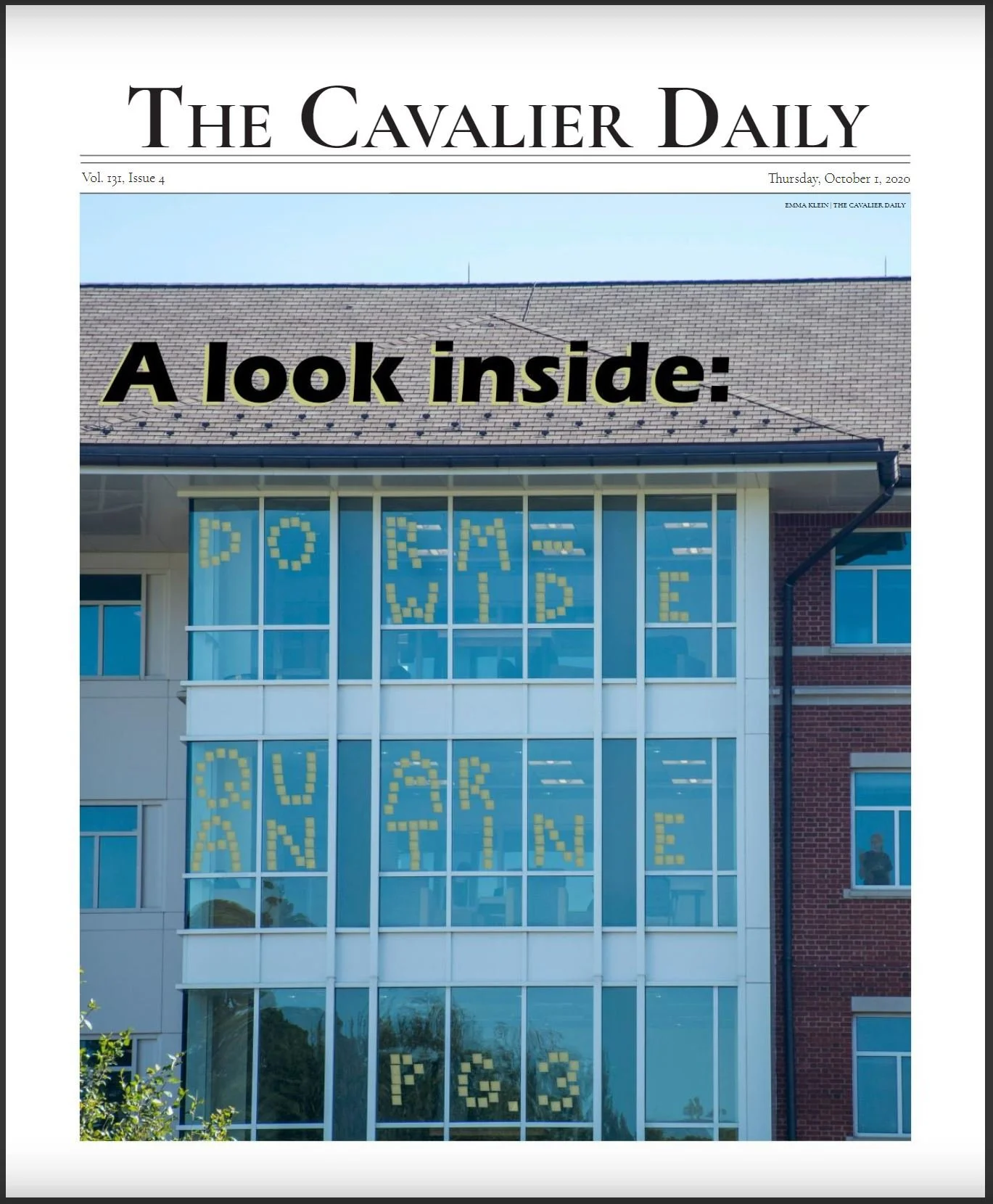
Dorm-Wide Quarantine
This sticky-note messaging is common throughout the dorms of UVA, however, this is not a practical effect. I took a photo of a sticky note through a window at my apartment and used it to create this effect. I thought this effect was a fun nod to the popular way to decorate dorm windows. I used the same color from the sticky note to back the text at the top of the image to tie it in and make the whole thing more cohesive. The student in the window on the right is also not really there. It is a photo I took of myself and edited in.
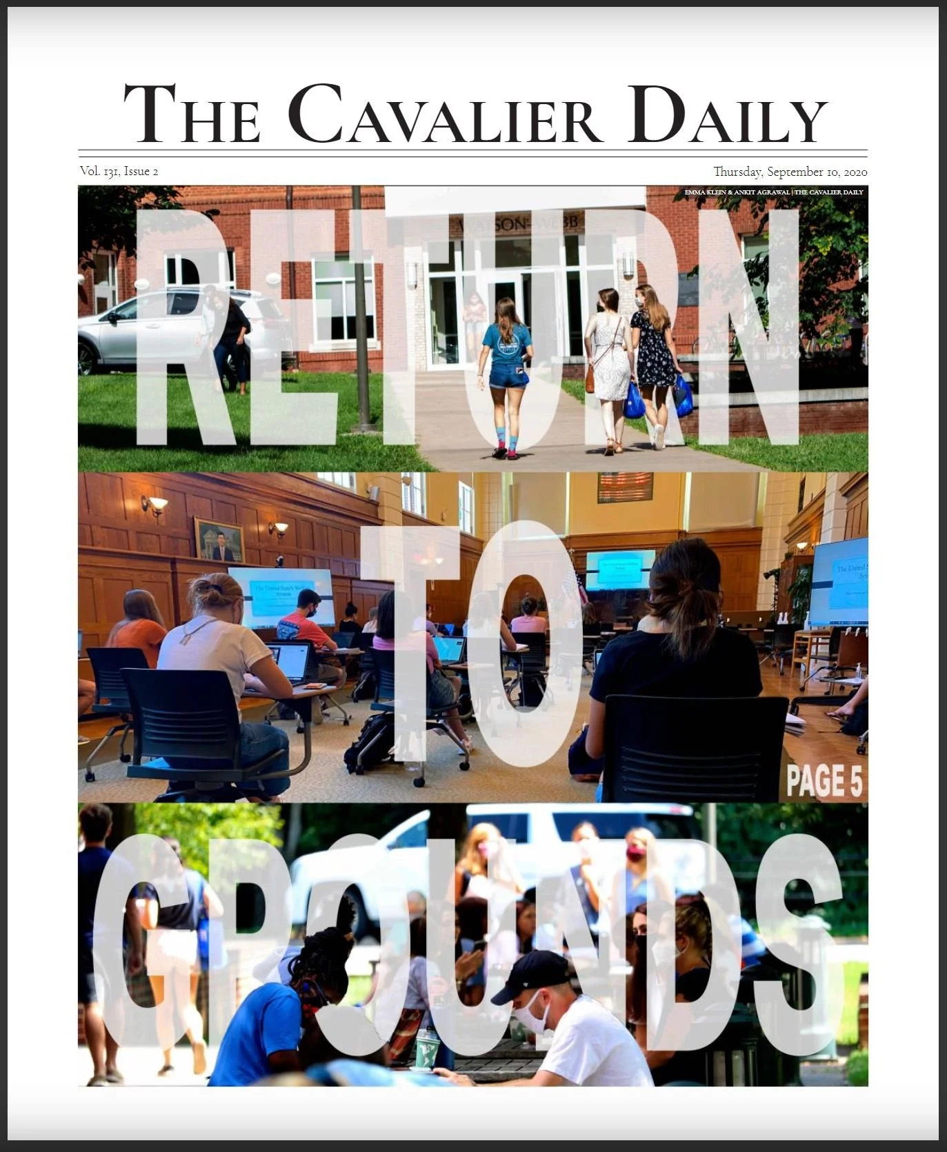
Return to Grounds
This was an issue from the start of a semester which highlights the differences this semester as compared to others. Students wear masks and sit spread out in their classroom. However, I also wanted to showcase the way some things are still the same. I chose photos that showcased community persisting despite change. I edited the photos to be saturated and warm to reflect the positive attitude that many students felt at returning to be with their classmates.
The top two photos, the edit, and the design are mine, the bottom photo was taken by another staff member.

